A brand refresh for a fiercely independent research institution

CGD reduces global poverty and improves lives with innovative economic research that drives better policy and practice by the world’s top decision makers.
The Occasion
For their 20th anniversary, CGD reached out to us as their existing web design partner agency to refresh the look and feel of their brand and website.
Embodying the Brand
Committed to transparency, diversity, and professional and personal integrity, their work challenges the status quo at powerful institutions to achieve better development practices that recognize the inherent dignity of all persons.

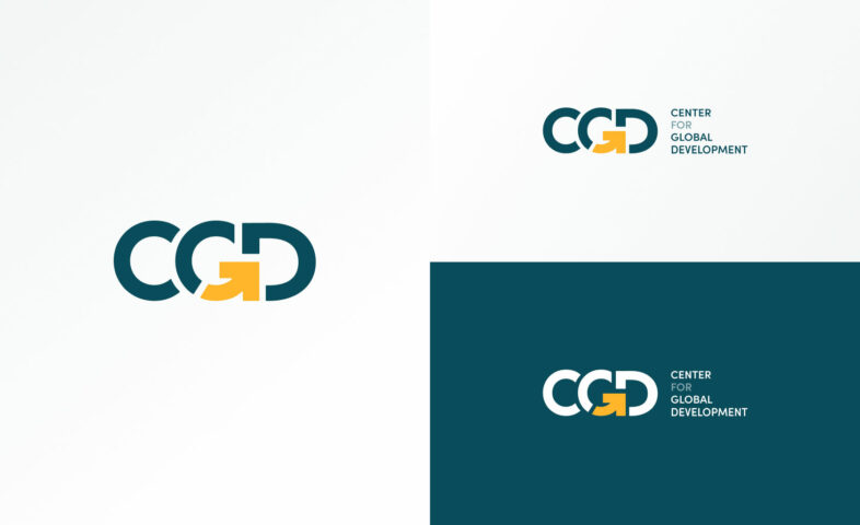
A key element of the refreshed brand design is the new CGD logo. Translating a sense of movement into a static image is a difficult task—but our designers worked closely with CGD to capture it in their logo.

Building on themes of forward motion and global dimensions from their old logo, the new version transforms these ideas into an instantly recognizable brand element.
The arrow cleverly incorporated into the organization’s appellation tells a story all by itself—CGD is moving forward with a thoughtful, purposeful, and powerful global mission.

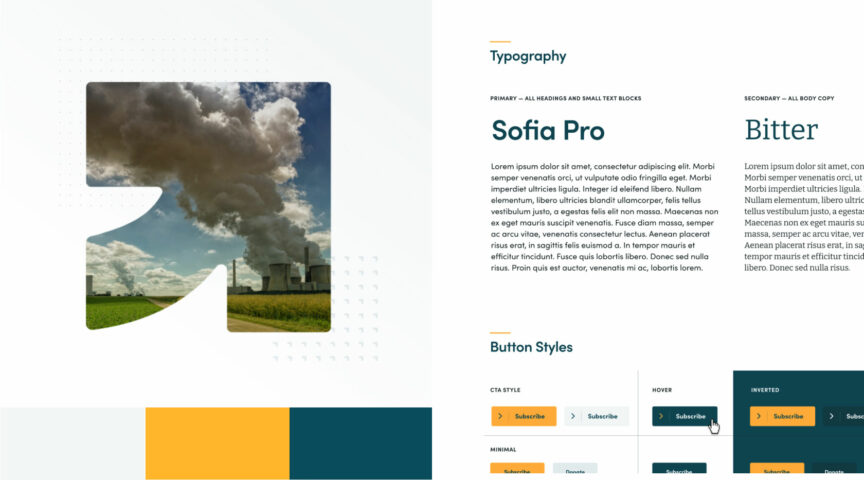
Visual storytelling is reinforced across the website wherever CGD makes use of the arrow from our logo design in other assets and collateral to tie them back to their brand. This design feature amplifies messaging around their impact as they continue to build out their content.


CGD leaned on WDG to design a streamlined aesthetic that elevates the excellence of their work. We wanted to champion their ideas and thought leadership with a framework that feels fresh, modern, and vibrant without being too complicated.
A strategic user journey combines with bold visual elements to draw in audiences and invite them to explore CGD’s content and learn more about their impact. The refined brand color scheme brings a freshness to the website without losing the sense of urgency and seriousness in their work.
Faced with the challenge of representing the depth and dimensionality of CGD, our designers were inspired to find ways to visually communicate a sense of forward momentum and progress on the flat plane of a website. The result is a dynamic flow of alternating elements that weaves text and images together and speaks to the convening nature of the organization.

Thoughtful design and connections improve user engagement journeys on a website. With CGD, their content is the source of valuable information that proves their methods work. Sharing specific and general content for their audiences invites engagement, but it also requires strategic solutions for contextualizing, prioritizing, and organizing an ever-expanding library of content.
Focusing in on the content that really reflects CGD’s mission and values, WDG provided them with wayfinding tools and features that elevate what’s recent and relevant while keeping hold of articles and commentary that establish their thought leadership. Their updated website gives them the ability to curate dynamic content in filterable, searchable resource libraries that help audiences access their outbound work. With a streamlined information architecture, users have clear pathways in and out of related content.
For a deeper look at the transformation from WDG’s previous with work CGD, check out our case study for the original Center for Global Development website redesign.
