Bring aviation safety to the digital forefront.
See the Work
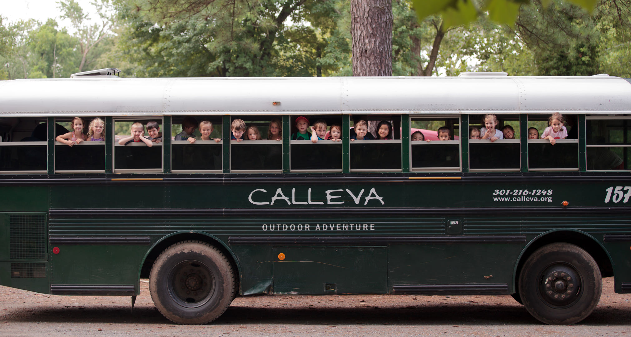
alleva is an outdoor educational nonprofit organization that has been a staple in the DC area for adventurers of all ages for 24 years. Calleva operates year-round programs with over 100 partner organizations and schools through mobile programming, offering summer camps, wilderness educational experiences, environmental education, and small-scale sustainable farming.
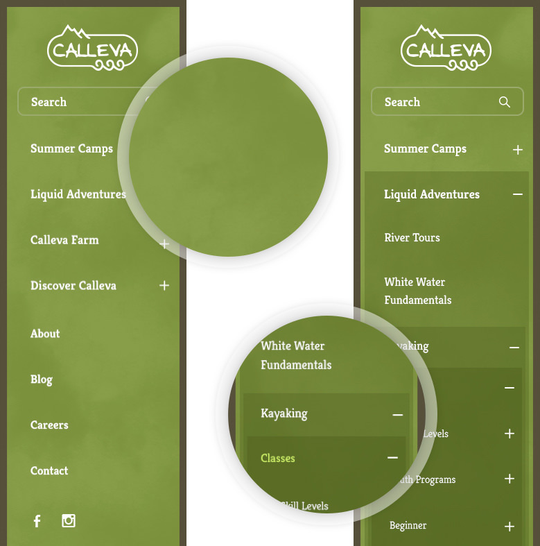
WDG partnered with Calleva to redesign their outdated site. WDG strategists began with a quick drive search. The large amount of information on Calleva’s previous site presented a particular organizational challenge. Our strategists helped organize the information architecture (IA) into a functional site map with flexible structure that easily allowed for site updates and additions. A collapsible left navigation menu incorporated nesting pages with strategically grouped sections of related events, camp opportunities, and age groups. This intuitive page structure created a seamless user experience that blended functionality with aesthetics.
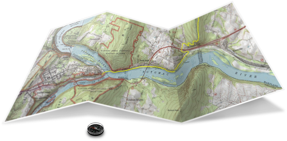
Calleva approached WDG designers with a request for a stylistic refresh on their existing website. The outdated original design targeted a younger audience with textured backgrounds and darker tones; to help shift their messaging towards new audiences, WDG designers created a cleaner, brighter style that blended earth tones with crisp, attractive assets.
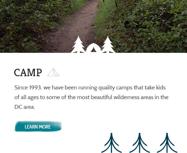
Calleva’s site is centered around three major program sections: Camp, River, and Farm. For design to showcase each section individually, small, elegant details were incorporated throughout the site to create visual consistency. Delicate iconography for each section was intermixed with a natural color palette, including field-green navigation menus, sky-blue brushstroke buttons, and more. Aesthetically, the finished design portrays a lively tone that balances organic elements with clean grids and fine lines.
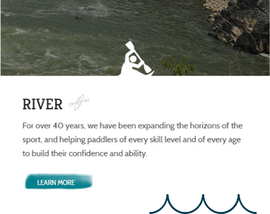
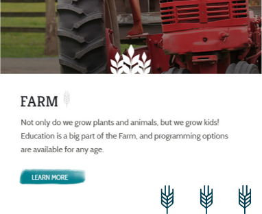

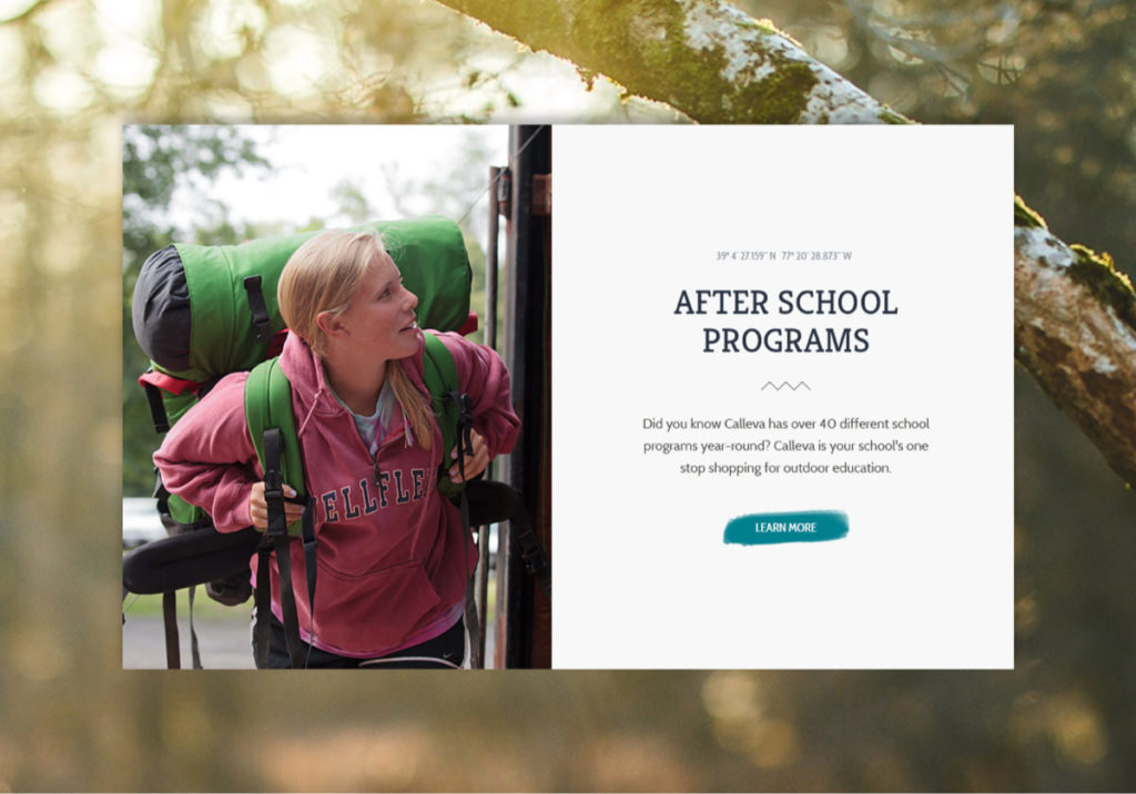
Calleva offers a plethora of customizable programs for participants of all ages. Since Calleva needed to be able to quickly create new pages to accommodate these programs, WDG harnessed the power of WordPress flexible layouts. This equipped admins with a powerful and user-friendly CMS to facilitate updates and modifications easily. Related programs were grouped through strategically organized page structures. Additionally, WDG leveraged related taxonomies to display programs in related fashions. A modular design helped make the overall site mobile-responsive, with featured blogs, easily navigable forms, and major event promotions. Together, these elements showcase expert voices to help appeal to specific target audiences.
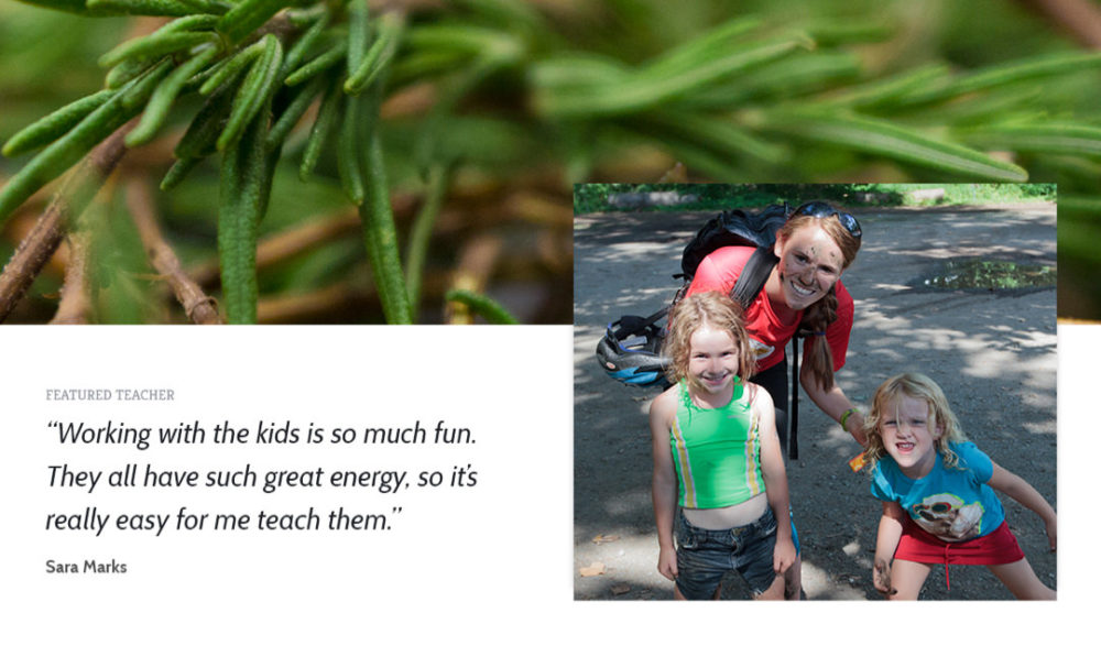
Calleva provided a strong photography collection for WDG to choose appropriate and lively images from. The images were carefully selected to not only feature the beautiful camp landscape, but also the personality and expertise of the counselors. Highlighted testimonials, prominently featured portraits, and personalized messages from counselors created an approachable tone to attract campers and businesses alike.
