Advancing democracy on a global stage.
See the Work

AccessPoint is an established leader in providing employment-related services across industries. They provide services in human resources, staffing, and recruiting.
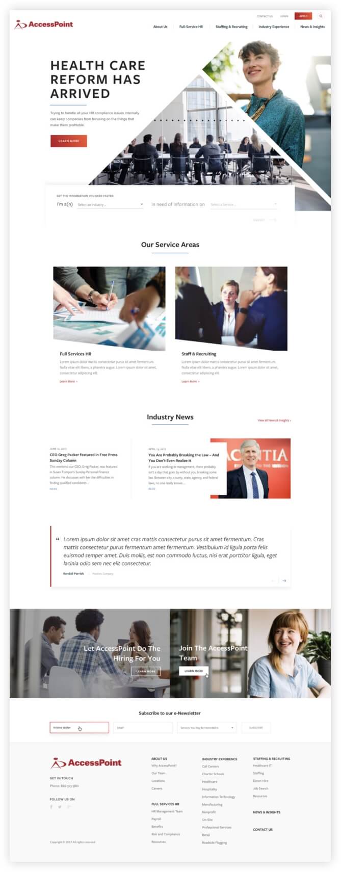
WDG partnered with AccessPoint for a full-scale site redesign, including a restructured information architecture, refreshed aesthetic, and comprehensive content writing.
Consolidate three distinct sites into a main site for a streamlined user experience with improved navigation and flexibility. Refresh branding and custom content as well.
Reconfigured information architecture, navigation, and taxonomies to combine all sites into a single entity. Tailored designs and content to reinforce the new branding.
Improved user experience through customization, site speed, and tailored content.
132.12% increase in sessions
100% increase in avg. session duration

Our Content Marketing team created a targeted information architecture to recenter the user experience, including a restructured navigation and page hierarchy. We also established brand voice and tone, as well as messaging for site content through key strategy exercises and working sessions. Our team worked to reconfigure AccessPoint’s messaging within their brand to better target specific services and industries for increased conversions. We also created a comprehensive set of strategic guidelines to ensure consistent copy across all pages.
The WDG Strategy and Design teams worked closely to create a self-identifying quiz on the homepage. The quiz segments users according to need, thereby driving users further into the site. The custom quiz provides selections specific to unique audiences and better tailors content based on visitor needs. We worked closely with AccessPoint’s team to establish iconography for every industry and service with a clean and consistent style. AccessPoint’s team is now able to be less dependent on photography for the buildout and site maintenance.


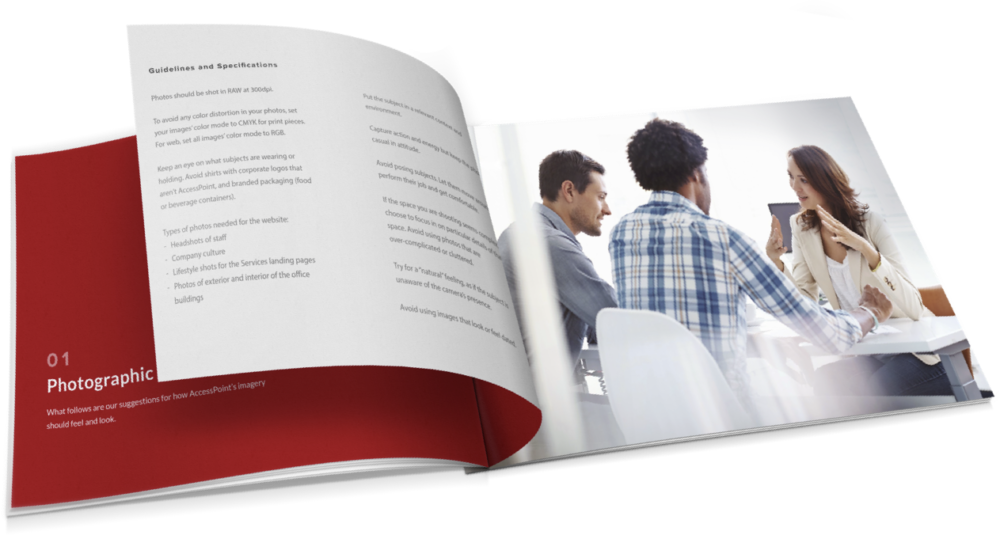
As a key part of the site refresh, new assets were required. WDG designers crafted custom photography guidelines to establish style, mood, color and shot types with specifications and examples. AccessPoint’s team is able to integrate carefully styled shots with a consistent theme across the site and ensures longevity as the site continues to scale.


Content and design teams worked in a cross-team collaboration process. This allowed for design and content to influence one another in real time. AccessPoint’s team was able to visualize written content in context with design as a result, creating a more streamlined approval process. In terms of creation, the collaborative process permitted our teams to integrate specific content elements into the wireframes for improved design accuracy. Each of the stylized components were identified and labeled for the AccessPoint team as flexible or non-flexible layouts in a kitchen sink. Elements included featured cards, content with images, right rail options, and recommendations for style component pairings.

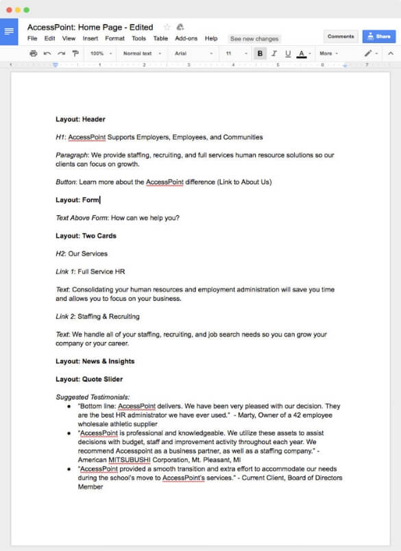
WDG’s Content Marketing team wrote all content for several high level landing pages. The improved content direction emphasized the newly aggregated branding of AccessPoint subsidiary organizations through cohesive messaging. Our team worked with AccessPoint in a multi-round revision process to ensure rapid content production. To create aesthetic and page continuity, we worked in tandem with our design team throughout the project lifecycle. This included leveraging a content audit of AccessPoint’s site to inform initial wireframes. We also worked simultaneously with design to integrate written content into the approved designs. Our team provided layout direction and asset suggestions in the content copy as well, creating contextualized recommendations for specific assets.

intuitive information architecture streamlines the overall site structure with improved taxonomies.
For the back end, our development team created customized posts for news. The industries and services pages were built using flexible layouts on WordPress for an easier administrative experience and to ensure content longevity. The custom office location taxonomies had their own archive view and were used to cover all of the state level locations as well as the cities with single or multiple offices.

On the front end, our development team created a custom designed mega menu which integrated the supplementary sites with main site navigations in an improved site structure. Customization extended to AccessPoint’s kitchen sink of image options, testimonials, and text sliders. For increased user engagement, we created unique accordion elements with the ability to expand upon opening. Using custom AJAX filters for the “Our Team” and “News” pages allows the user to quickly and efficiently locate key information from filtered results. They also allow for real-time updates so the user does not need to wait for the page refresh. These were built with speed in mind as queries used to generate the filters are stored in the database for quicker rendering for all users.
