The Importance of a User-Friendly Digital Resource Library

The Importance of a User-Friendly DIGITAL Resource Library
Is your website directing audiences to the content they’re looking for?
Today, content development is more important than ever to businesses looking to provide value to their clients and customers. The digital literacy of internet users is increasing exponentially with each passing day. You’ve got to stay on top of keeping your website in line with contemporary expectations for useability.
Most people are accustomed to having certain web features and functionality, certain navigation and search experiences from using the internet for daily tasks.
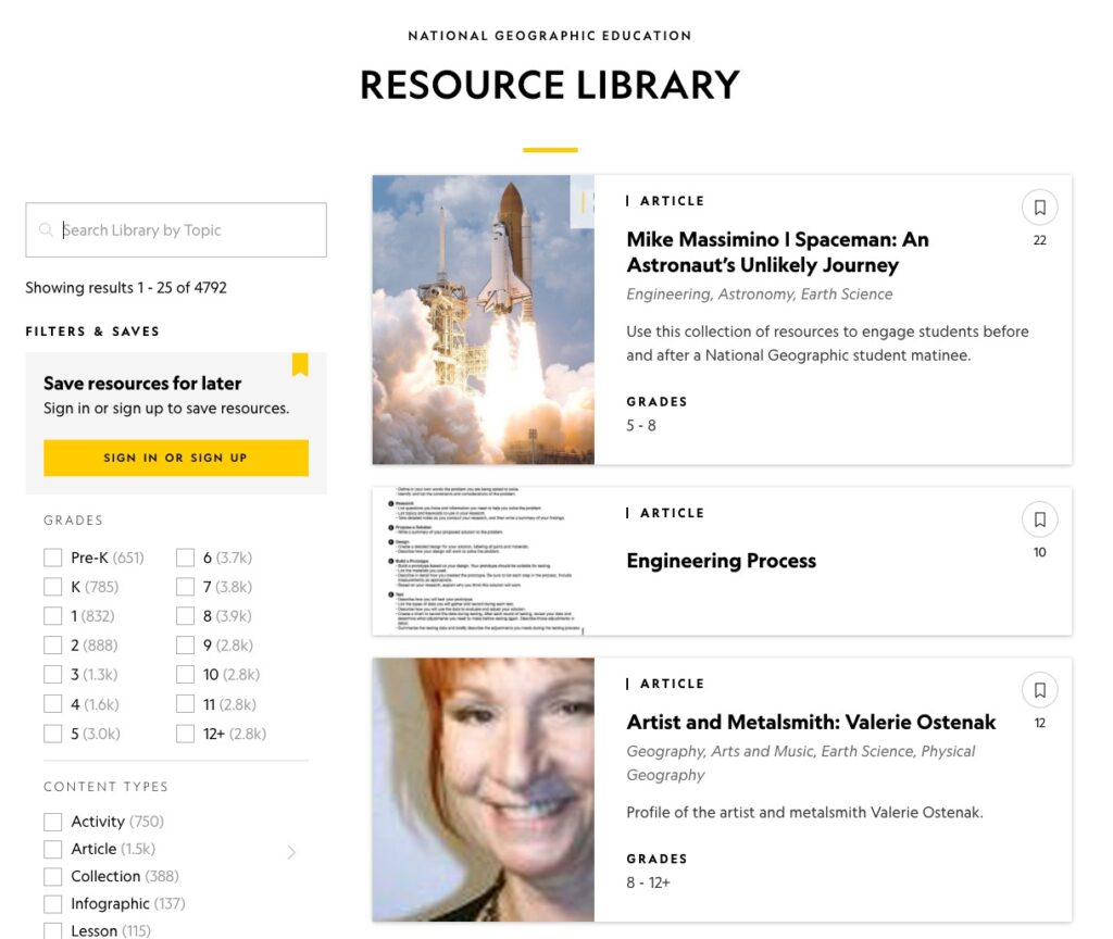
For example, when you search “resource library” on Google, the top result is the National Geographic Society’s resource library. And for good reason—this publication known for its authoritative resources isn’t shy about offering a great experience to site visitors looking for content.

Does your website host a high volume of content like PDFs, ebooks, reports, whitepapers, podcasts, webinars, or videos?
If organized correctly and displayed proudly, an online resource library is a brilliant way to invite your audiences into the work that you do.
Let’s walk through the essentials that make for a great resource library.
1. Start with the Search
We recently discussed examples of search experiences driven by insights into audience behavior, and why you want to build more than just a basic search function into your website.
While WordPress and Drupal include out-of-the-box search capabilities, the bare minimum just won’t cut it anymore in a world where every business can benefit from publishing as much high quality content as possible.
Know that dedicating resources during any web design or redesign project to finding and programming additional plugins for your search experience is a powerful investment. That’s because the same tech that drives your search is the basis for a good resource library.
With a search function that gives users the opportunity to filter by keyword, date, relevance and other key identifiers, you already have the foundation for building out, organizing, and maintaining a library architecture.
2. Get Centralized
When you’ve got a great search up and running, and you have lots of resources to put in front of your audiences, don’t be afraid to consolidate everything into one place. Instead of publishing content in silos across your domain, get it all together under one resource library and put that section where your users can easily find it.
Additionally, gathering your content from multiple domains and putting it all in a central location automatically increases your organic search traffic.
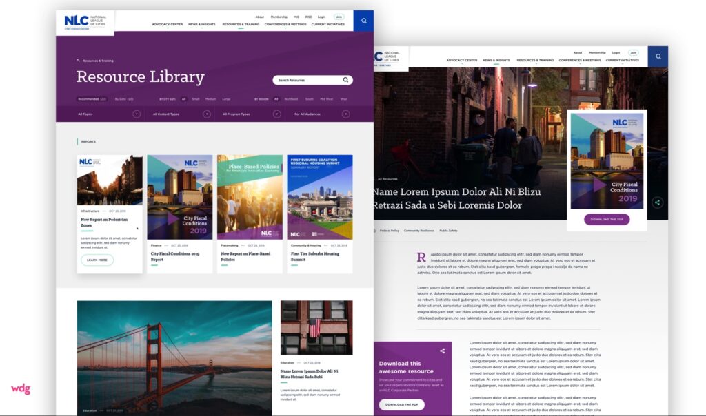
We helped The National League of Cities do just that with their web redesign. Visitors to their site will see that Resources & Training are called out on their top-level navigation, and their Resource Library is the first choice for users in that section.
But that isn’t the only place their content lives. Each piece that’s contributed can be pulled from its storage location in the resource library to any page on the site that wants to feature it.

Featuring components with specific content on any page allows you the flexibility to establish a primary repository or resource library in order to keep your content organized in a central location. From a library, the content—whether it be blogs, insights, success stories, case studies, press releases, etc.—can be pulled onto appropriate pages across the site.
Just like how it works at your local public library—you borrow a book when you need it, but it belongs to a central location where it’s returned to and waits for someone else to check it out.
This arrangement is the perfect marriage of publishing dynamic, up to date content and archiving reusable pieces that build domain authority in your area of expertise.
3. Curate Your Feed
As an association that provides valuable insights to a broad range of members, NLC delivers its users a resource library that not only allows them to conduct an effective on-page search, but also to see what NLC curates for relevant resources.
Doing so builds out a timely feed of published content that puts news and trending insights right in front of their users.
Content is always best when it’s contextualized—thinking about a resource library as a curated feed sets your business up to publish content in a way that users are hungry for.
Here are a couple of examples of curated feeds that really impress us:
- United States Institute of Peace has a high-impact and visually striking Publications page that gives users access to their very active publishing feed. A rotating carousel of curated content ties this resource section to the experience on their homepage, and gives a sense of the urgency and importance of the work they do.
- Incorporating a front-and-center search experience along with customizable cover tiles linking to their content, Software AG Government Solutions gives their users a bright, clear, and navigable resource center. It’s easy to find the ebooks, whitepapers, and reports that help their clients make decisions.
- Adobe Experience Manager’s marketing automation software business Marketo owns a bold resource center with a sleek information design that is instantly recognizable as part of the Adobe family of products. Their sidebar menu of Collections instantly helps a user enter into a flow to find what they’re looking for. They don’t pass up the opportunity to position their product with a call to action to try it out after someone has the chance to look over their featured resources. This resource page really feels like a publication, but zeroed in on all things Marketo.
- Simplicity takes center stage in the A-LIGN resource center. Everything is labeled, tagged, and laid out with their users in mind. With a focus on cybersecurity compliance and audit services, they curate their resources page using clear subheadings and descriptions to guide visitors through their content covering complicated topics.
All of these businesses took on a strategy that makes their libraries live and breathe so they get long lasting value out of their content.
When we talk about a “resource library” we aren’t necessarily referring to just a filterable list of your pdfs—we love re-imagining different ways to get your audiences engaging with your website. Asking not just what to include but how to present it gets our gears spinning on how high-value features like a curated resource library feed can fit into your web design project.
Gated Content
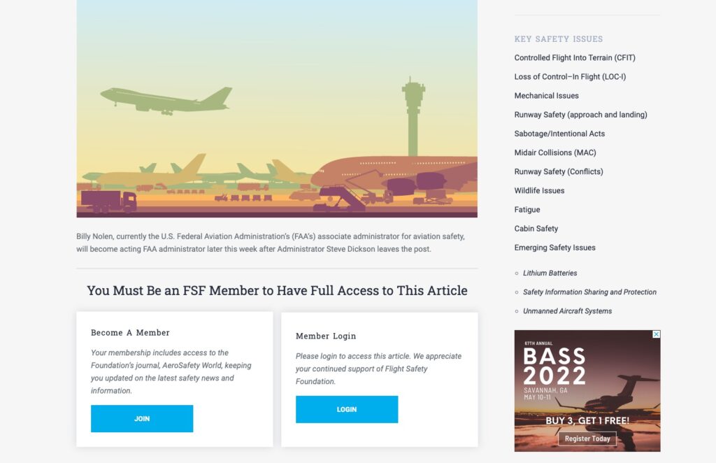
What if you want to keep your content contained in a Members Only section? Nothing wrong with that—in fact, it’s a great way to get exclusive content in front of your most dedicated audiences. You might even decide that offering a mix of public and gated content is the best approach for your business.
Associations that we’ve worked with like Flight Safety Foundation, AdvaMed and Trusted Choice found this to be the responsible and effective way to deliver content without leaving important business information open to the public.
Even though they’re publishing behind a username and password, all of the same best practices still apply. A reliable search experience, intuitive information architecture, and relevant content at the ready are things that users expect along with their highly personalized, members only access.

4. Make Sure It’s Shareable
You want to make sure that what you post to your website can get shared far and wide. Integrate your resource library with the main social media outlets that your users frequent. Even in the case of Trusted Choice with their mix of gated and publicly available content, they are providing branded promotional content designed for their members to download, customize, and share on the internet.
Whether your audiences are association members, customers, other businesses, or anyone else, you want to make sure that you give them the opportunity to share your content.
Every share is a potential lead waiting to convert. And you might miss out on those shares if your content isn’t in one easy-to-access, easy-to-search location!
Thinking about shareability branching out from a centralized resource center can also set up your website for future growth. Look at how we designed resource sharing for Kendal, a business that coordinates independent senior living arrangements all across the country. Their community of businesses each have their own subsite based on geographic location.
Their main website publishes articles and content that can be shared by any subsite and prevents what could easily turn into a lot of siloed content pulling their overall brand in too many directions. Through this method of content sharing, every location gets updated, relevant resources to their customers while Kendal keeps everyone on the same page and builds a central repository.
Let’s Recap
No matter your industry, specialization, or expertise, the audience demand for content is growing every day. If you’re actively responding to those demands, it’s likely that your website is filling up with tons and tons of valuable resources.
- Does your website have a robust search solution?
- Are your content resources easily available in one easily accessible location?
- Are you organizing and curating your content to keep it fresh and relevant?
- Can your employees, users, and members navigate and share the content they want?
A content heavy website needs a good resource library that can serve as an informational hub for its users. If you already have one, then you should be able to answer yes to all of those questions.
Don’t worry if that’s not the case—we’re here to help with your next website design project. We have the tools and techniques to transform your website’s current strategy into streamlined, friendly, and powerful user experience. If you need a new resource library on your website, get in touch with us today to have a conversation about what will work best for your audience.

