You’re Invited to a UX Workshop

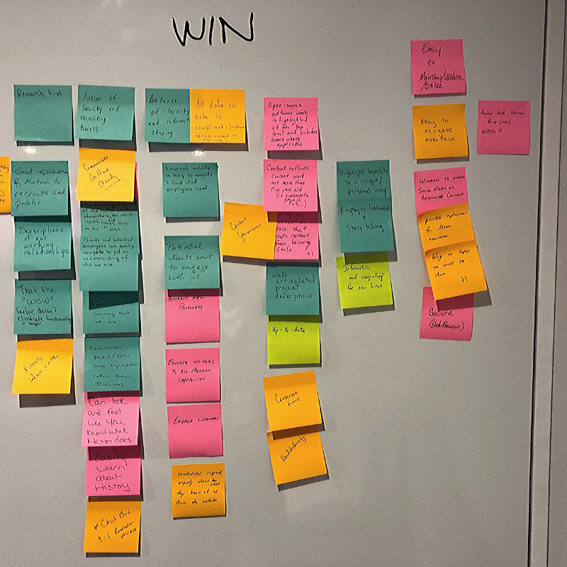
In our newsletter UX Bytes, our content doesn’t strictly cover UX in the most literal sense — IA, navigation, components, et al — and the same can be said for UX workshops. These sessions between agencies and clients will touch upon aspects of the user experience but that’s only the beginning of the work. They’re condensed, accelerated collaborations meant to jumpstart the discovery and strategy for your new website. Work that would have taken weeks gets accomplished in a matter of days.
The Task at Hand
Ultimately, a workshop attempts to arrive at a fundamental truth — why does your organization really want/need a website redesign? Beyond the fact that it’s been six years or the site looks dated — why has your team decided on this and what’s the actual purpose of a new digital presence for you? Lead generation? Recruiting? Increased donations? Brand awareness? All of the above? A workshop also surfaces what your team does not want from the website, which can be just as illuminating and valuable.
Workshops are two or three devoted days for the teams to get acquainted and clarify the scope, milestones and direction of the project early on, taking the ideas originally in the RFP and fully fleshing it out into an agreed-upon plan. It’s team therapy, a marathon ideation session, a high-level conversation that transcends a standard meeting or presentation. It speaks to the vast gap between a partnership versus a vendor and creates a shared sense of ownership and solidarity of vision for the build.
The Best Laid Plans
A workshop should coincide with the project kick-off that includes essential team leads, key decision-makers and internal stakeholders. Again, this is less of a presentation and more of a collaboration: seat accordingly. If the agency is doing all the talking, the workshop won’t bode well. Conversely, if the client gets into a rabbit hole of tertiary inter-office tangents and the agency doesn’t refocus the conversation, the result will be equally fruitless.
Coming into the workshop, there will already be preliminary discovery and user research from the agency’s side — these insights providing buy-in and a guide for the work ahead. And this work, distilled to its simplest terms, is figuring out who the client and their audience is, what they both want, and how this relationship can be mutually beneficial for both parties.

Workshop Breakdown
- Brand Attributes
- Voice & Tone
- Content Readability/SEO Overview
- Proto-Content Samples
- Proto-Personas
- User Journeys
- Competitive Analysis
- Preliminary Sitemap
- Sketching Wireframes
Key Considerations:
- What are your priority pages? What’s the purpose of each of these?
- Who comes to your site and what do they do while they’re there?
- What’s the referring source of traffic, e.g., direct, organic, email, Social?
- What’s the desired engagement from a user on these pages?
- What kind/positioning of content and which CTAs would best maximize this conversion?
An Illustrated Future
Your digital agency has just handed you a marker. You panic. They want you to sketch a wireframe. You’re in the middle of a UX workshop and it’s come time for a collaborative sketching exercise. What do you do?
These group-sketch activities are potentially potent opportunities for design decision buy-in — but the client has to buy-in to the idea of sketching first. While everyone may think they’re a writer, almost no one sees themself as a web designer. And when most professionals are asked to draw something, they may flashback to a high school art class and mull over just how long it’s been since they’ve illustrated anything. The agency should illustrate that this is not a problem but an opportunity. And in art, there are no mistakes.
Despite the name, a UX workshop should still be a little fun.
Better by Design
Designers and UX experts know that drawing stakeholders and key team members into these collaboratively visual exercises can create a sense of shared ownership, expedite the design process, and better showcase the ideas of the client. But you have to market the activity appropriately to put the client at ease. They hear draw and they think art and they freeze up. To that point, don’t say the word Design — again, that term intimidates people. Reinforce that this is a sketch — that it’s supposed to be rough, messy and ugly. This lowers group anxiety and raises participation willingness.
Remind them that whatever they sketch is not some end-all-be-all creative asset or a genius interface solution — it’s a jumping-off-point and catalyst for conversation. It’s not the end product but rather an impetus for exploration of design direction and IA/UI/UX thoughts. Tell them to forget the details, embrace the ugly and the more sketches the better. It’s about churning out a bevy of no-fidelity illustrations for high-fidelity ideation.

Color by Committee
This next bit sounds simple because it is: don’t give them pens; give them wide-felt markers. Anything with a fine point will be associated with detail, and detail is associated with expertise, and expertise carries a certain pressure. So thin out the pressure by thickening the drawing tools at their disposal.
Another basic logistical trick is to limit the space they’re drawing on — don’t give them a whiteboard or a full sheet of paper. A sticky note or index card will suffice. The less space provided, the more comfortable they are in knowing this needn’t be a masterpiece. It reemphasizes that it’s a casual exercise, akin to jotting something down on a napkin (that later becomes a site page).
A group sketch exercise is mostly about drawing conclusions.
Think Outside the Lines
A professional agency move is to showcase amateur sketch examples in the beginning. Basic shapes, lines and arrows will go a long way to manage expectations and inspire confidence in the group. People thrive most when given a reasonable challenge and nothing inspires more than a deadline, i.e., give the client a time restraint and a quota of sketches to make. These sketching challenges can also branch out to other levels of abstraction beyond site layouts. Agencies, you could implement the following sketch prompts:
How would you illustrate …
- Your work culture?
- Your ideal team?
- Your audience?
- Your mission statement?
- Your content capacity?
A Shared Vision
The pushback to all of this might be, “Aren’t we just doing your job for you?” Explain to the client that in fact, you’re prompting them to share their insights visually as they glean insight into the UX world of making wires and beyond.
The joint creative endeavor of a UX workshop not only expedites the process for agencies and clients but also minimizes the budget by addressing red flags and icebergs before they have a chance to emerge. All of this establishes an invaluable trust between the teams moving forward and ensures that the new website will best represent the original vision.
