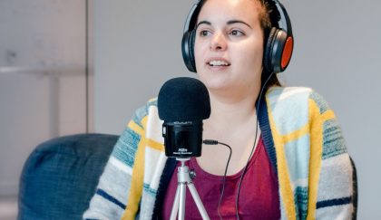
Feedback Podcast Recap: Web Accessibility

Spring is upon us, with its charming feast for the senses. But imagine if you couldn’t see the cherry blossoms or hear the blue birds tweeting. At least 20 percent of people have some sort of disability that limits their capacity not just in the real world, but online as well. This is why making websites more accessible is a paramount concern in the digital space.
In our latest Feedback episode, WDG sat down with expert developer Amanda Blake to clearly define web accessibility, along with sharing tools and insights to ensure that we make the internet more inclusive for everyone.
A Human Issue
The realities of web accessibility were squarely put into focus for Amanda years ago in Baltimore. At a Refresh event there, she heard a blind man speak about his experiences going to websites and using screen readers, detailing his difficulties and what web developers could do better. And we could do better. Beyond complying to Section 508 — the government guidelines concerning web accessibility — the experience brought a resonant humanity to the issue for Amanda.
Covering Your Needs
In this conversation, Lisette and Amanda cover the three ADA guideline levels — A, AA, AAA — and which is most applicable depending on what kind of organization/website you have. This episode also features practical tips, such as making sure you’re always using heading tags, page titles, and alt text especially. For design, there is always the need to have the right color contrast ratio for clarity. There are some purveying rules to know whether your website is truly accessible. All the text on a web page should still be clearly readable at a 200 percent zoom. On a desktop, a user should be able to navigate the site with just their keyboard.
“The whole definition of accessibility is to break down those barriers so everyone has the same functionality across the board and are able to do all the same things no matter what.”
— Amanda Blake, WDG Developer
It Just Makes Sense
There are other considerations to be made. At some point, all of us may be temporarily disabled, be that a broken limb or suffering a concussion — so the discussion of accessibility is more universal than one might think. And following accessibility guidelines is not just about being legally prudent or compassionate to your fellow person, it’s also just sound business sense. Designing a more accessible website means making better content with an optimal UX, which in fact benefits all your users and ultimately strengthens your SEO and leads to more conversions.
Access to More
Delve into all of this and more in the latest episode of The Feedback. Check it out now and subscribe wherever you get your podcasts. WDG Presents: The Feedback is available on Spotify, Apple Podcasts, Google Play, RadioPublic, Pocketcasts, Podcast Addict, and more!
Do you have a personal web accessibility story? Drop us a line at [email protected] or tweet us at wdgtweet. We’d love to learn more about how accessible accessibility is for you.

