5 Best Designed D.C. Area Nonprofit Websites
Washington D.C. is a hub for thousands of nonprofit organizations that impact many communities, whether in the metro area or on a global scale. Due to the capitol’s reputation, wealth of resources, and policy opportunities, nonprofits thrive in D.C.
At WDG, we’ve worked with many important nonprofits that provide valuable thought leadership and help create large-scale change. We know first hand that a key element in effectively promoting any nonprofit mission is utilizing an elegantly designed and powerfully developed website.
In evaluating 5 of the best designed D.C. area nonprofit websites, we examined each for site structure and functionality, overall design merit, quality and use of aesthetics, choice of assets, and user-experience. Our extensive work with nonprofits in the DC area gave us a unique understanding of how their sites can–and should–drive donations and gain support.
1. The Aspen Institute
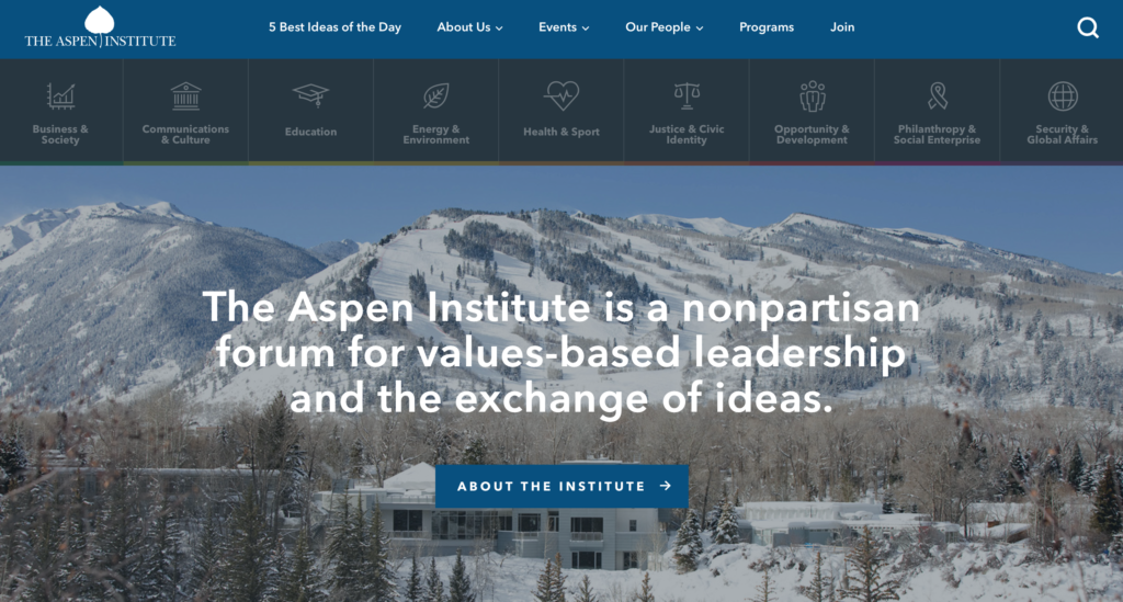
A world-changing nonpartisan think tank, The Aspen Institute brings together thought leaders and influential changemakers through their forum for values-based leadership and idea exchange.
With extensive work across multiple verticals and an ability to influence a vast array of audiences, The Aspen Institute’s website balances both functionality and deliberate design for a seamless user experience. Graceful hover effects draw the eye towards specific information while tiles are used to differentiate between important sections. The elegant layout is supported by carefully curated assets and purposeful copy designed to create conversions.
The DC based international nonprofit has been influencing policy change for over 60 years, and its web presence has evolved with a content-first approach centered on promotion. Events, insights, and ideas are carefully organized into related modules on their cleanly designed WordPress site, with subtle animation used to maneuver the user into the correct information vertical.
At WDG, we’ve also worked with expansive projects, leveraging our team’s strategy and design expertise to organize related information. Check out our work with the American Enterprise Institute and see how we migrated four properties into a single, streamlined experience powered by WordPress.
See more of The Aspen Institute’s elegant design at https://www.aspeninstitute.org.
2. Golden Triangle
The Golden Triangle BID is a nonprofit organization dedicated to improving and fostering growth in the 43 block business district of Washington D.C. The organization has been in D.C. for 20 years, and has become a key resource for capital improvement projects, events, and public improvement initiatives.
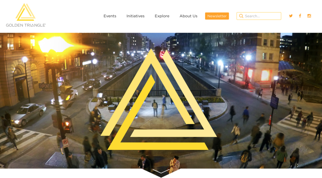
As a go-to resource for growing business initiatives in the metro area, Golden Triangle strives to connect users through an incredible home page experience. The beautiful design is not only user-oriented, utilizing a clean scroll and interactive features, but also carefully categorizes information to best promote the downtown business district.
A clean, open page design on the WordPress platform allows users to easily navigate important events and initiatives. The striking logo design serves as a creative hero element, linking the user directly to valuable information like the interactive metro area map. Click-worthy copy is reinforced by gorgeous imagery highlighting the best D.C. has to offer.
See more of The Golden Triangle’s innovative design strategy at https://goldentriangledc.com.
3. Conservation International
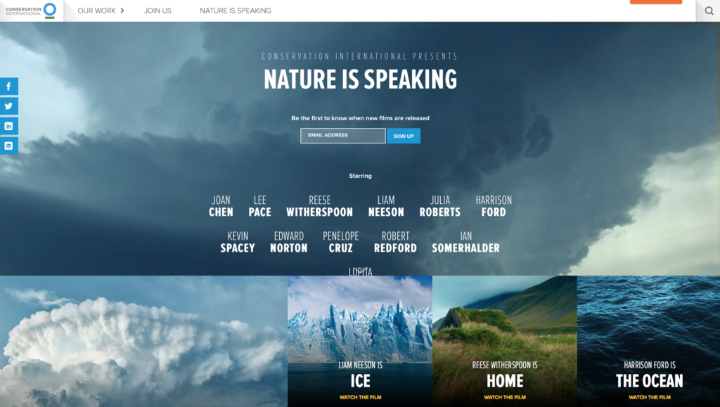
Powerful imagery, coupled with clear calls to action and prevalent donation solicitations, make Conservation International’s website a powerful fundraising tool for a universal cause. The site engages viewers through distinct calls to action and personalized content.
The D.C.-based nonprofit utilizes sleek multimedia and social media integrations to increase involvement opportunities for supporters. Interactive experiences, such as tracking a blue whale in real-time or taking promotional quizzes, abound with creative depth across the site. They are also masters in utilizing animations, gifs, and gorgeous background treatments to reinforce their messaging and brand.
A particularly striking page is the “Nature is Speaking” vertical. The integration of celebrity-voiced short movies not only offers powerful name recognition, but also cleverly integrates video within the tile design. The multilingual options solicit support from users in any of their 1200 protected areas within 77 countries, linking a broad network of audiences through related content.
See more of their incredible visual design at http://www.conservation.org.
4. U.S. Green Building Council
USGBC is an invaluable organization providing resources, thought processes, and education on incorporating greener building practices and designs. As industry leaders, branding is continually reinforced and emphasized across the site.
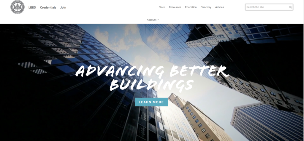
Their Drupal platform layout emulates the core values of LEED, the most widely used third-party verification for certifying green buildings. The overall design balances clean grids with striking imagery. The modern efficiency of the website design translates into a tailored user experience.
Utilizing flat design and clean scrolls, the D.C. membership-based nonprofit effectively promotes sustainability in buildings design, construction, and operation without overwhelming the viewer. Information for certification, research, and industry initiatives are clearly demarcated and organized through user-friendly navigation tools.
Clever microinteractions are also subtly integrated throughout the site in order to create conversions and promote membership. At WDG, we have helped organize site structures through clean design for impressive clients, including GHT Limited. As an industry leader in sustainable engineering and design consulting services, the site required a shift from Drupal to custom flexible WordPress templates.
See more of their effective strategy at work at http://www.usgbc.org.
5. The Malala Fund
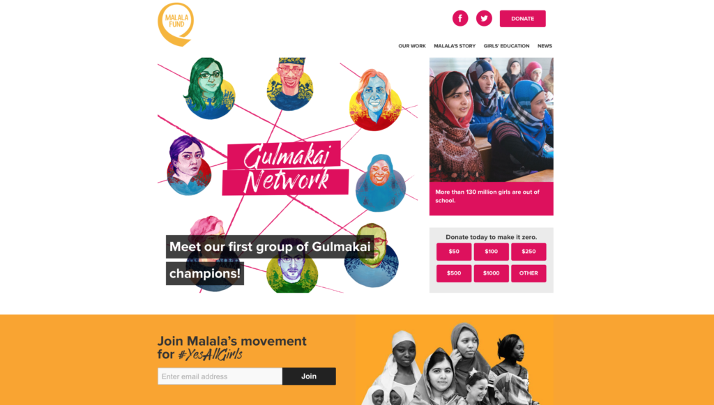
The Malala Fund is a powerful website advocating for resource and policy changes for girls’ education across the globe, particularly in developing nations. Formed by Nobel Laureate Malala Yousafzai, the site utilizes activism to promote equal access to education for girls worldwide.
The Malala Fund combines some of the best elements in modern design. The striking color palette connects users directly with the face of organization, as well as highlights the direct applicability of donations by featuring images and testimonials of recipients.
As a fundraising tool, the site highlights user stories and creates conversion through a humanized tone, video integrations, and personal narratives. The seemingly hand-drawn design elements and text further support the personalized user experience.
Distinct calls to action are centrally located, connecting design and functionality in a seamlessly integrated experience. The highly clickable copy also lends itself to the website namesake’s narrative, conveying purpose clearly and linking back continuously to easily-located donation buttons.
See more of the Malala Fund’s powerful design at https://www.malala.org.
Ultimately, our experience working with a wide variety of nonprofit organizations allows us to leverage powerful site design to grow mission outreach. These key insights, and many more like them, have helped us empower organizations affecting worldwide change such as American Red Cross and the United States Institute of Peace (USIP). By providing mobile-friendly technical solutions for relief and aid organizations on a global scale, WDG is a vital resource for any nonprofit’s digital outreach strategy.
Interested in knowing more about WDG’s work with nonprofit organizations? Contact us or check out our more of our expert insights!

