Designing With No Images

99 Problems and Having No Images Is All of Them
Current website trends heavily depend upon large imagery to attract customers. And this is no surprise as images create a great impact and add that personable touch. Imagery is easily utilized to support the textual messages associated with it, and to sell products and lifestyles.
And yet, often times imagery just isn’t a feasible option. Budget and subject matter can greatly impact the ability to acquire images. Whether it’s photography, videography, or custom illustrations, the cost to fill a large website can quickly add up. Imagery is also a huge commitment, as videography and spot illustrations can take a long time to make and edit for use on the web. Not to mention, imagery can influence how quickly your site launches, from all the revisions and time it takes to acquire them.
So if imagery just isn’t an option, what can you use to make your site visually impactful?
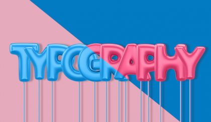
The answer is typography. Typography can be an excellent tool in taking your content from bland to engaging, even in the absence of imagery.
Hierarchy is Everything.
The way typography is utilized on a web page is crucial. It functions as not only the embodiment of your content, but also as a visual storyteller. Our advice? Play up what you do have.
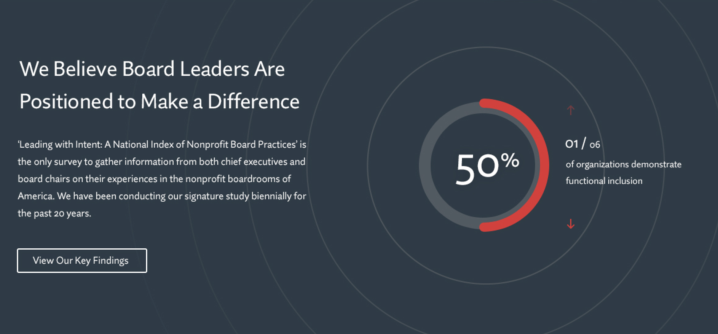
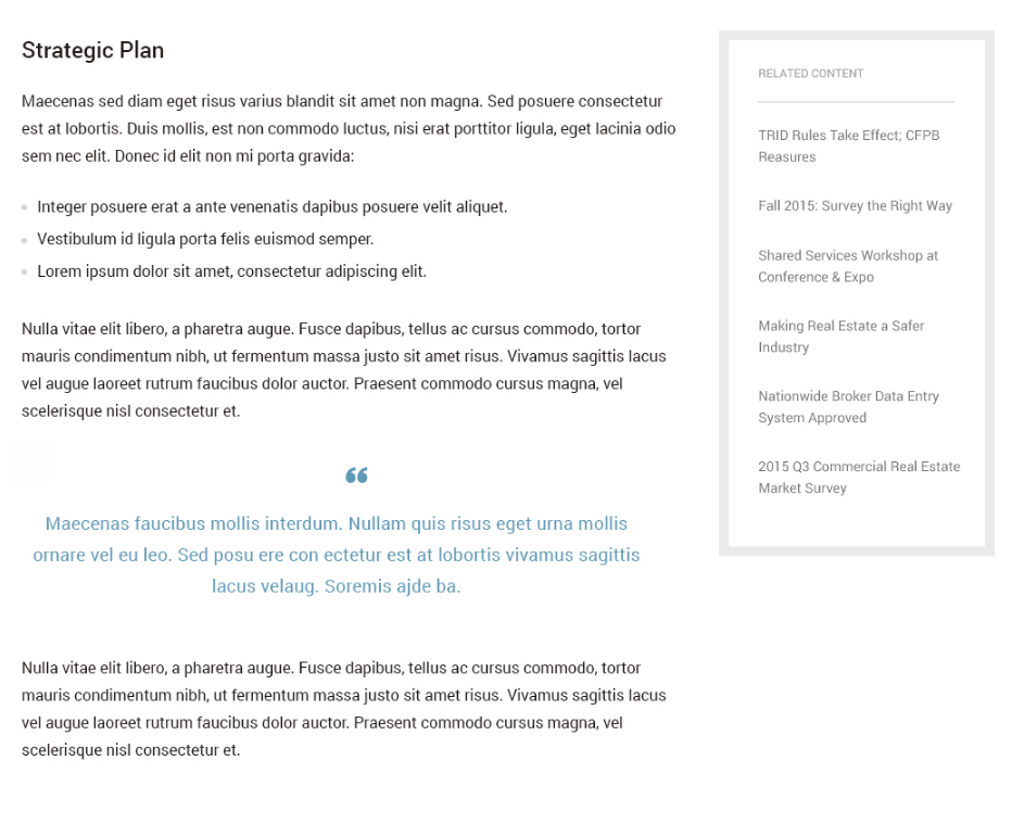
A user wants to be able to read your content with ease, so don’t limit yourself with doing text-dumps. Break up your content so that it is not only easier to navigation, but easy to take takeaways from. A few of my favorite ways to break up a content heavy page is to use stylized pull-out quotes and to highlight statistics. They’re unobtrusive, add visual interest and character to the page. They also can be used throughout a page as visual aids to help readers know where they were if they happen to scroll away.
Be Selective With The Typefaces You Use
With resources like Google Fonts and Adobe Typekit, it can be tempting to go hog wild with your web font selections. Try not to be overwhelmed and think about what you’re looking for in a font. Not all typefaces are worthwhile to use on a website. Some are created with the intention of being used as large decorative titles and not much else. Be picky and test a handful of them out before committing to one or two. When typography is all you have it’s important to use typefaces that aren’t restrictive in their flexibility.
One helpful thing to do is to check all of a font’s characters. Some fonts have unique characters that are unexpected. For example, Futura might look great for your titles, but maybe its question mark is a little too abstract for your taste. Or maybe you don’t like the way that Merriweathers’ numbers are not sitting on the same baseline, and instead need something more like Chaparral Pro’s.
Another helpful tidbit to keep in mind is that typefaces that have a lot of font weights will give you more flexibility. Using different weights can help add different tonalities to your writing and web page. A word of warning, while it’s without a doubt tempting to use every weight a typeface might have, we would argue against doing that. The more weights you use the slower your website will perform. While you shouldn’t let this stop you from using 4 or 5 different weights, we encourage you to really think hard about whether you need that 10th weight.
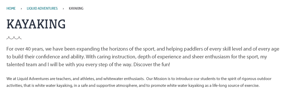
Additionally, it’s okay to use a display font for your headings to add personality, and to use a more streamlined font for your regular text.
We hope these suggestions help you in your decision making. Take heart that it’s not the end if you don’t have much or any imagery on your website. Typography is just one of the several tools you can use to reflect your company’s personality. We’ve talked about how you can also incorporate color here and how data visualizations can help you, in lieu of not having any imagery.


