Data Visualization Best Practices
Incorporating data visualizations is a great way to make your work stand out, and be more engaging. But, not all data visualizations are created equal! Today, I’m filling you in on some helpful hints to keep your data visuals—like infographics—effective and clear.
Choose the Right Data Visualization For Your Needs
First, use data that can be easily visualized—simple as that. If it requires a paragraph of text to provide context, then it defeats the purpose of using a visualization.
Once you have something to work with, how are you going to visualize it? Is the data a comparison of numbers? Are you trying to show change over time? Is the data a small piece of a larger whole? It’s easier to create a graphic when you have a clear idea of what exactly it is that you’re trying to illustrate.
Is the Visualization Accomplishing What It Needs To?
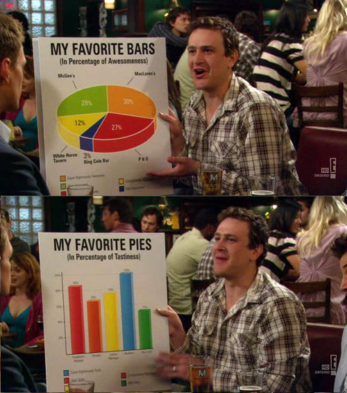
Who loves the show “How I Met Your Mother”? One of the characters, Marshall, uses some charts to explain his favorite pies and favorite bars. Both are good examples of how to choose a correct style for the data at hand, and have the added bonus of humorously getting his point across to the audience.
Build a Color Palette and Stick With It
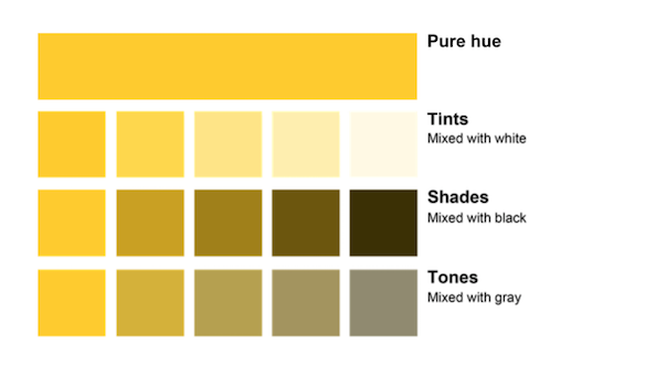
You don’t need to understand color theory to build a color palette. Choose colors that go well together. Complementary, analogous, and triad colors are your best bet. That said, don’t use all the colors on the wheel. I usually stick with a maximum of 3 different colors. You can have as many shades, tints, and tones of 1 color as you’d like.
Any more, and you’ll find that your infographic might be hard to read.
Let’s say your data visualization is for a company project, and the company only has 1 color. That’s okay! Just incorporate different shades, tints, and tones of that color into your visualization.
Consistency is Key
When creating your data visualization, use the same iconography and typography throughout. Inconsistent elements are confusing for the reader; consistency is important for creating effective visualizations. ‘Nuf said.
Context & Accurate Data
Context should help your visual, but not tell the whole story. Keep it simple. The same can be said about the data. Keep it simple and accurate. Help guide your readers to the appropriate conclusion, without having to spell everything out for them. Don’t give misleading data, but paint a comprehensive story.
Consider The Audience
When in doubt, ask yourself these important questions:
- Who’s going to see this?
- What do I want them to take away from this?
- Am I saying what I think I am?
- In what context will my audience see this visualization?
- Is this laid out in an easy to comprehend manner?
Examples of Great Data Visualizations
