5 Design Principles for Non-Profits, and 5 Who Got It Right
In this digital new world, having a functional and intuitive online presence is essential. For non-profits, this couldn’t be more true. To bring your organization’s mission to the front, there are a few design principles for non-profits that you should follow.
Be Impact-Oriented
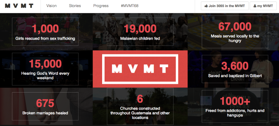
Users like solutions. They like to see that the services and products they’re buying have a direct impact on their lives. The same rule should be applied to non-profit websites. No doubt, there are hundreds of noble causes waiting to be heard. By focusing on what your organization is doing to help, users will feel their support is more worthwhile.
Take the mission-based MVMT. The homepage immediately greets the user with statistics and numbers on exactly how they have made a difference.
Tell Your Story with Visuals…
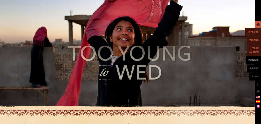
Nothing draws a user in like a good story. More specifically, a visual story. If you can effectively tell users why your non-profit is special—why they should donate—your website is doing its job. Too Young to Wed, a non-profit trying to end child and forced marriages, does a compelling job of this. As you scroll, they use huge, impactful pictures and quotes to show users who is being affected by child marriages.
…But Use Discretion
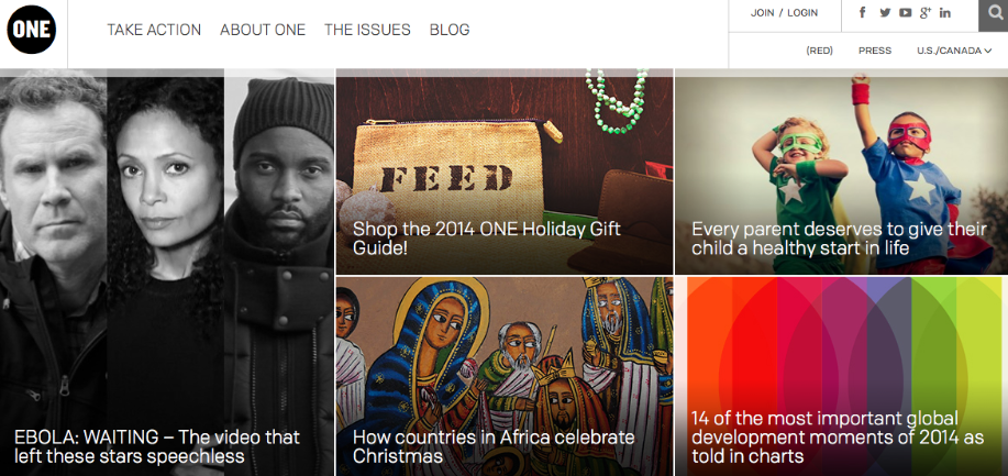
At the same time, don’t over-inundate your site with too many visuals, animations, and other flashy elements. First and foremost, your site needs to demonstrate the good you are doing. Make sure to balance this fine line. One, an organization focused on ending poverty and preventable disease, incorporates visual elements in a clean, restrained way. The images tell a story, but don’t detract away from the main message they stand for.
Work with People Who Understand You, Not People Who Just Want a Check
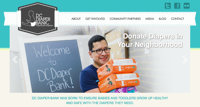
Finding an agency that can transform ideas into design is one thing. Finding an agency that aligns with your goals and works with you side-by-side to accomplish that mission is something completely different.
WDG’s giving initiative, GiveBack DC, provides non-profits websites services free of charge. After all, our Old Town shop started as an agency focusing on non-profit work. What better way to go back to our roots than giving back to those we originally served? DC Diaper Bank was one of the many non-profits we’ve supported since 2012.
User Experience is Key
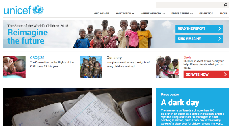
UX Magazine did a pretty neat study on the impact of UX for non-profits. What they found, in comparing UNICEF with The American Red Cross, was that a proper user experience helped improve donation conversation rates. Interestingly enough, The American Red Cross had a slightly less user-friendly desktop interface than UNICEF. Which is probably why they hired us to make their mobile checkout system more intuitive.
At the end of the day, these principles are all ones companies and organizations should use for successful websites. Luckily for you, our designers and strategists are experts at implementing stunning and functional design concepts. Get in touch today for more information!

