Capital Camp and Gov Days: Introducing Emotion into UX
Last Wednesday was the kick-off event for Capital Camp and Gov Days 2014, a three-day conference on Drupal and open source technology for the government. (WDG is a Gold-level Sponsor!) More than 500 people from government, contractor, and private sector industries were expected to be there, and with good reason. With a countless number of informational sessions, there was something for everyone to learn.
My favorite talk on Wednesday was delivered by Danielle Sheffler, project manager at New Target Inc., where she explored the ways designers can utilize emotion to not only convince users to stay on different websites, but to also incorporate emotion as a way to stand out from hundreds of thousands of websites online. Read on for more of her key points.
Base Content and Visual Hierarchy Of User Goals
The phrase “best web practices” can sometimes be a misnomer. Certainly there are best practices, but what’s best for a particular client and their website is relative to the goals they are trying to achieve, and the content and visuals used can help them meet those goals.
When designing a website, incorporate content and imagery that matters. With Templeton Honors College, for instance, WDG included personalized photography that captured the Templeton experience and student population to give future visitors a real sense of what the honors program was all about. These types of visual interest add that extra layer of emotion to a site that encourages visitors to stay.
Introduce an Element of Surprise
When designing, striking a balance between consistency and novelty is essential. People go online to find information and complete certain goals, but seeing screen after similar screen can leave users bored. Having surprising elements introduces a sense of novelty that users find interesting and distinctive.
I’ve always loved the TED-Ed website, not just because it provides insightful and provoking talks but also because the website itself really emulates a sense of discovery both in terms of content and visuals. There is consistency in its branding, but every page is a little different from the rest.
Help Users Make a Choice
A website should make obvious specific call outs for products, services, and other types of online choices, using a clear hierarchy and engaging imagery.

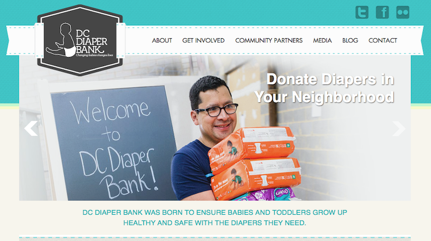
With DC Diaper Bank, we used compelling imagery and content to concisely explain what DC Diaper Bank is and what they do, while also providing users an avenue to donate. Visuals incite different emotions and give users a reason to go through with certain actions, so give them proper attention.
Have any more questions about how introducing emotion into user experience can bolster your website’s presence? Get in touch with us at WDG and learn how we can help strengthen your digital reach.

